| Qt常用控件介绍(一) | 您所在的位置:网站首页 › qt日期控件 › Qt常用控件介绍(一) |
Qt常用控件介绍(一)
|
Qt常用控件介绍
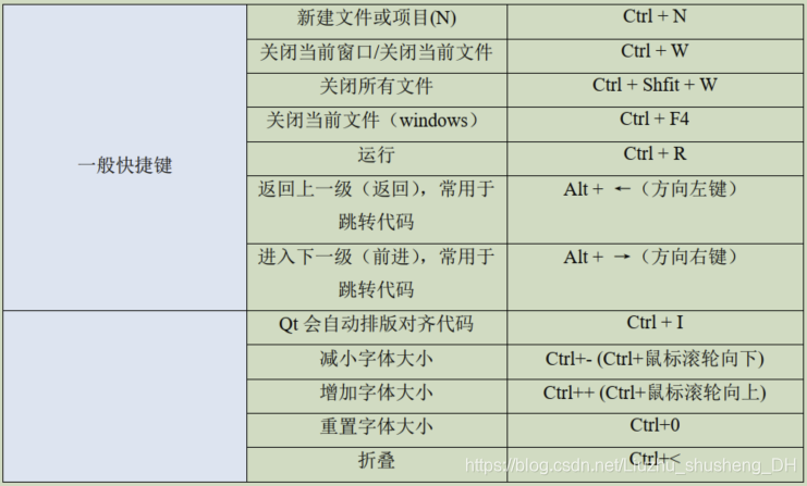
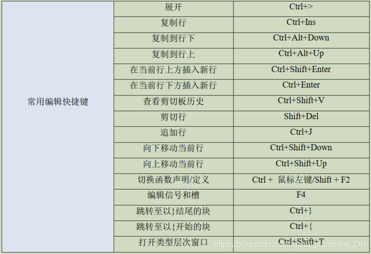
Qt Creator 的使用技巧Qt Creator的常用快捷键
按钮QPushButtonQToolButtonQRadioButtonQCheckBoxQCommandLinkButtonQDialogButtonBox
输入窗口部件QComboBoxQFontComboBoxQLineEditQTextEditQPlainTextEditQSpinBoxQDoubleSpinBoxQTimeEdit,QDateEdit,QDateTimeEditQDialQScrollBarQSliderQKeySequenceEdit
Qt Creator 的使用技巧
Qt Creator的常用快捷键
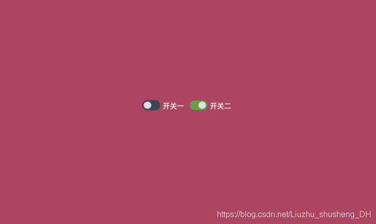
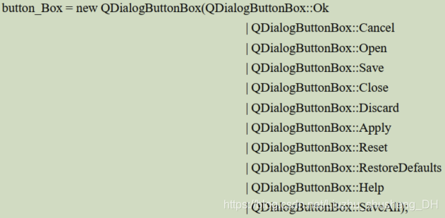
Qt按钮部件是一种常用的部件之一,Qt内置六种按钮部件如下: 运行效果如下: 工具按钮(QToolButton)区别于普通按钮(QPushButton)的一点是,工具按钮(QToolButton)可以带图标。这里区别下图标和按钮的背景图片是不一样的。通常我们在 QToolBar 这种工具条(工具栏)上设置不同的按钮。 /* 引入 QToolButton 类 */ #include /* 引入 QToolBar 类 */ #include private: /* 声明一个 QToolButton 对象 */ QToolButton *toolButton; /* 声明一个 QToolBar 对象 */ QToolBar *toolBar; /****************mainwindow.cpp 编程添加代码***********/ #include /* 实例化 QToolBar 对象 */ toolBar = new QToolBar(this); /* 设置 toolBar 的位置和大小 */ toolBar->setGeometry(0, 0, 800, 100); /* 实例化 QStyle 类对象,用于设置风格,调用系统类自带的图标 */ QStyle *style = QApplication::style(); /* 使用 Qt 自带的标准图标,可以在帮助文档里搜索 QStyle::StandardPixmap */ QIcon icon =style->standardIcon(QStyle::SP_TitleBarContextHelpButton); /* 实例化 QToolButton 对象 */ toolButton = new QToolButton(); /* 设置图标 */ toolButton->setIcon(icon); /* 设置要显示的文本 */ toolButton->setText("帮助"); /* 调用 setToolButtonStyle()方法,设置 toolButoon 的样式,设置为文本置于 图标下方 */ toolButton->setToolButtonStyle(Qt::ToolButtonTextUnderIcon); /* 最后将 toolButton 添加到 ToolBar 里 */ toolBar->addWidget(toolButton);运行效果如下所示: QRadioButton 部件提供了一个带有文本标签的单选框(单选按钮)。 QRadioButton 是一个可以切换选中(checked)或未选中(unchecked)状态的选项按钮。单选框通常呈现给用户一个“多选一”的选择。也就是说,在一组单选框中,一次只能选中一个单选框。默认在同一个父对象下,初始化后点击它们是互斥状态。 /* 引入 QRadioButton */ #include private: /* 声明两个 QRadioButton 对象 */ QRadioButton *radioButton1; QRadioButton *radioButton2; /****************mainwindow.cpp 编程添加代码***********/ this->setStyleSheet("QMainWindow {background-color: rgba(200, 50,100, 100%);}"); /* 实例化对象 */ radioButton1 = new QRadioButton(this); radioButton2 = new QRadioButton(this); /* 设置两个 QRadioButton 的位置和显示大小 */ radioButton1->setGeometry(300, 200, 100, 50); radioButton2->setGeometry(400, 200, 100, 50); /* 设置两个 QRadioButton 的显示文本 */ radioButton1->setText("开关一"); radioButton2->setText("开关二"); /* 设置初始状态, radioButton1 的 Checked 为 false,另一个为 true*/ radioButton1->setChecked(false); radioButton2->setChecked(true); /****************main.cpp 编程添加代码***********/ #include /* 指定文件 */ QFile file(":/style.qss"); /* 判断文件是否存在 */ if (file.exists() ) { /* 以只读的方式打开 */ file.open(QFile::ReadOnly); /* 以字符串的方式保存读出的结果 */ QString styleSheet = QLatin1String(file.readAll()); /* 设置全局样式 */ qApp->setStyleSheet(styleSheet); /* 关闭文件 */ file.close(); } /****************qss文件 编程添加代码***********/ QRadioButton{ spacing: 2px; color: white; } QRadioButton::indicator { width: 45px; height: 30px; } QRadioButton::indicator:unchecked { image: url(:/images/switch_off.png); } QRadioButton::indicator:checked { image: url(:/images/switch_on.png); }运行效果如下所示: QCheckBox 继承 QAbstractButton。复选按钮(复选框)与 RadioButton 的区别是选择模式,单选按钮提供多选一,复选按钮提供多选多。 /* 引入 QCheckBox */ #include private: /* 声明一个 QCheckBox 对象 */ QCheckBox *checkBox; private slots: /* 声明 QCheckBox 的槽函数,并带参数传递,用这个参数接收信号的参数 */ void checkBoxStateChanged(int); /****************mainwindow.cpp 编程添加代码***********/ this->setStyleSheet("QMainWindow {background-color: rgba(100, 100, 100, 100%);}"); /* 实例化对象 */ checkBox = new QCheckBox(this); /* 设置QCheckBox位置和显示大小 */ checkBox->setGeometry(350, 200, 250, 50); /* 初始化三态复选框的状态为Checked */ checkBox->setCheckState(Qt::Checked); /* 设置显示的文本 */ checkBox->setText("初始化为Checked状态"); /* 开启三态模式,必须开启,否则只有两种状态,即Checked和Unchecked */ checkBox->setTristate(); /* 连接checkBox的信号stateChanged(int),与我们定义的槽checkBoxStateChanged(int)连接 */ connect(checkBox, SIGNAL(stateChanged(int)), this, SLOT(checkBoxStateChanged(int))); /* 槽函数的实现 */ void MainWindow::checkBoxStateChanged(int state) { /* 判断checkBox的state状态,设置checkBox的文本 */ switch (state) { case Qt::Checked: /* 选中状态 */ checkBox->setText("Checked状态"); break; case Qt::Unchecked: /* 未选中状态 */ checkBox->setText("Unchecked状态"); break; case Qt::PartiallyChecked: /* 半选状态 */ checkBox->setText("PartiallyChecked状态"); break; default: break; } } /****************main.cpp 编程添加代码***********/ #include /* 指定文件 */ QFile file(":/style.qss"); /* 判断文件是否存在 */ if (file.exists() ) { /* 以只读的方式打开 */ file.open(QFile::ReadOnly); /* 以字符串的方式保存读出的结果 */ QString styleSheet = QLatin1String(file.readAll()); /* 设置全局样式 */ qApp->setStyleSheet(styleSheet); /* 关闭文件 */ file.close(); } /****************qss文件 编程添加代码***********/ QCheckBox{ spacing: 5px; color: white; } QCheckBox::indicator { width: 50px; height: 50px; } QCheckBox::indicator:enabled:unchecked { image: url(:/images/unchecked.png); } QCheckBox::indicator:enabled:checked { image: url(:/images/checked.png); } QCheckBox::indicator:enabled:indeterminate { image: url(:/images/indeterminate.png); }运行效果如下: QCommandLinkButton 控件中文名是“命令链接按钮 ”。 QCommandLinkButton 继承QPushButton。CommandLinkButton 控件和 RadioButton 相似,都是用于在互斥选项中选择一项。表面上同平面按钮一样,但是 CommandLinkButton 除带有正常的按钮上的文字描述文本外,默认情况下,它也将携带一个箭头图标,表明按下按钮将打开另一个窗口或页面。 /* 引入QCommandLinkButton */ #include private: /* 声明一个QCommandLinkButton对象 */ QCommandLinkButton *commandLinkButton; private slots: /* 声明槽函数,用于点击commandLinkButton后触发 */ void commandLinkButtonClicked(); /****************mainwindow.cpp 编程添加代码***********/ /* 引入桌面服务,用来打开系统文件夹对话框 */ #include /* 引入QUrl */ #include /* 实例化对象 */ commandLinkButton = new QCommandLinkButton( "打开桌面目录", "点击此将调用系统的窗口打开桌面目录",this); /* 设置QCommandLinkButton位置和显示大小 */ commandLinkButton->setGeometry(300, 200, 250, 60); /* 信号槽连接 */ connect(commandLinkButton, SIGNAL(clicked()), this, SLOT(commandLinkButtonClicked())); void MainWindow::commandLinkButtonClicked() { /* 调用系统服务打开/home目录 */ QDesktopServices::openUrl(QUrl("C:/Users/12645/Desktop") ); }运行效果如下: 对话框和消息框通常以符合该平台界面指导原则的布局呈现按钮。不同平台的对话框总是有不同的布局。 QDialogButtonBox 允许开发人员向其添加按钮,并将自动使用适合用户桌面环境的布局。 也就是说我们可以使用系统的自带的对话框按钮,也可以自己定义对话框按钮。 运行效果如下所示: QTextEdit 类提供了一个查看器/编辑器小部件。 #include #include private: /* 声明一个QTextEdit对象 */ QTextEdit *textEdit; /* 声明两个QPushButton对象 */ QPushButton *pushButtonSelectAll; QPushButton *pushButtonClearAll; private slots: /* 声明两个槽函数,响应按钮点击响应的事件 */ void pushButtonSelectAllClicked(); void pushButtonClearAllClicked(); /****************mainwindow.cpp 编程添加代码***********/ /* 引入QDebug */ #include /* 设置主窗体的显示位置与大小 */ this->setGeometry(0, 0, 800, 480); /* 实例和对象,设置位置和显示大小 */ textEdit = new QTextEdit(this); textEdit->setGeometry(0, 0, 800, 400); /* 实例和对象,设置位置和显示大小,设置文本 */ pushButtonSelectAll = new QPushButton(this); pushButtonSelectAll->setGeometry(200, 420, 50, 20); pushButtonSelectAll->setText("全选"); /* 实例和对象,设置位置和显示大小,设置文本 */ pushButtonClearAll = new QPushButton(this); pushButtonClearAll->setGeometry(500, 420, 50, 20); pushButtonClearAll->setText("清除"); /* 信号槽连接 */ connect(pushButtonSelectAll, SIGNAL(clicked()), this, SLOT(pushButtonSelectAllClicked())); connect(pushButtonClearAll, SIGNAL(clicked()), this, SLOT(pushButtonClearAllClicked())); void MainWindow::pushButtonSelectAllClicked() { /* 设置焦点为textEdit */ textEdit->setFocus();//当我们在文本输入框里输入完成后,当点击全选按钮后,需要设置焦点到 textEdit 上,否则将不能设置全选。 /* 判断文本编辑框内容是否为空,不为空则全选 */ if(!textEdit->toPlainText().isEmpty()){ /* 全选 */ textEdit->selectAll(); } } void MainWindow::pushButtonClearAllClicked() { /* 清空textEdit里的文本内容 */ textEdit->clear(); }运行效果如下所示: QPlainTextEdit 类提供了一个用于编辑和显示纯文本的小部件,常用于显示多行文本或简单文本。QPlainTextEdit 可以理解为 QTextEdit 的低配版。 QPlainTextEdit 支持纯文本显示, QTextEdit 支持富文本(支持多种格式,比如插入图片,链接等)显示。就是多一个样式。 QPlainTextEdit 显示的效率比 QTextEdit 高,如果需要显示大量文字,尤其是需要滚动条来回滚动的时候, QPlainTextEdit 要好很多。 #include #include private: /* 声明对象 */ QPlainTextEdit *plainTextEdit; QRadioButton *radioButton; private slots: /* 槽函数 */ void radioButtonClicked(); /****************mainwindow.cpp 编程添加代码***********/ #include #include #include /* 设置当前程序的工作目录为可执行程序的工作目录 */ QDir::setCurrent(QCoreApplication::applicationDirPath()); this->setGeometry(0, 0, 800, 480); plainTextEdit = new QPlainTextEdit(this); plainTextEdit->setGeometry(0, 50, 800, 430); radioButton = new QRadioButton(this); radioButton->setGeometry(650, 20, 100, 20); radioButton->setText("只读模式"); /* 打开可执行程序目录里的moc_mainwindow.cpp,注意如果是Windows下 moc_mainwindow.cpp并不在当前目录,而在上一级目录"../moc_mainwindow.cpp"*/ QFile file("moc_mainwindow.cpp"); /* 以只读模式打开,但是可以在plainTextEdit里编辑 */ file.open((QFile::ReadOnly | QFile::Text)); /* 加载到文件流 */ QTextStream in(&file); /* 从文本流中读取全部 */ plainTextEdit->insertPlainText(in.readAll()); /* 信号槽连接 */ connect(radioButton, SIGNAL(clicked()), this, SLOT(radioButtonClicked())); void MainWindow::radioButtonClicked() { /* 检查radioButton是否选中 */ if(radioButton->isChecked()) { /* 设置为只读模式 */ plainTextEdit->setReadOnly(true); } else { /* 设置为非只读模式 */ plainTextEdit->setReadOnly(false); } }运行效果如下所示:
QSpinBox 类提供了一个微调框小部件。 #include private: /* 声明一个 QSpinBox 对象 */ QSpinBox *spinBox; private slots: /* 槽函数 */ void spinBoxValueChanged(int); /****************mainwindow.cpp 编程添加代码***********/ this->setGeometry(0, 0, 800, 480); /* 设置主窗口背景颜色,rgb颜色标准,a代表不透明度(0~100)*/ this->setStyleSheet("QMainWindow{background-color: " "rgba(100, 100, 100, 100%) }"); spinBox = new QSpinBox(this); spinBox->setGeometry(350, 200, 150, 30); /* 设置范围0~100 */ spinBox->setRange(0, 100); /* 设置步长为10 */ spinBox->setSingleStep(10); /* 设置初始值为100 */ spinBox->setValue(100); /* 设置后缀 */ spinBox->setSuffix("%不透明度"); /* 信号槽连接 */ connect(spinBox,SIGNAL(valueChanged(int)), this, SLOT(spinBoxValueChanged(int))); void MainWindow::spinBoxValueChanged(int opacity) { /* 转换为double数据类型 */ double dobleopacity = (double)opacity / 100; /* 设置窗体不透明度,范围是0.0~1.0。1则为不透明,0为全透明 */ this->setWindowOpacity(dobleopacity); }运行效果如下所示: QDoubleSpinBox 类提供了一个用于处理浮点值微调框小部件。与 QSpinBox 作用基本一样, 与 QSpinBox 不同的是, QDoubleSpinBox 类处理的是浮点值数据 #include private: /* 声明一个QDoubleSpinBox对象 */ QDoubleSpinBox *doubleSpinBox; private slots: /* 槽函数 */ void doubleSpinBoxValueChanged(double); /****************mainwindow.cpp 编程添加代码***********/ this->setGeometry(0, 0, 800, 480); /* 实例化和设置显示的位置与大小 */ doubleSpinBox = new QDoubleSpinBox(this); doubleSpinBox->setGeometry((this->width() - 200) / 2, (this->height() - 30) / 2, 200, 30); /* 设置前缀 */ doubleSpinBox->setPrefix("窗口大小"); /* 设置后缀 */ doubleSpinBox->setSuffix("%"); /* 设置范围 */ doubleSpinBox->setRange(50.00, 100.00); /* 设置初始值 */ doubleSpinBox->setValue(100.00); /* 设置步长 */ doubleSpinBox->setSingleStep(0.1); /* 信号槽连接 */ connect(doubleSpinBox, SIGNAL(valueChanged(double)), SLOT(doubleSpinBoxValueChanged(double))); void MainWindow::doubleSpinBoxValueChanged(double value) { /* 重新计算窗口的宽与高 */ int w = 800 * value / 100; int h = 480 * value / 100; /* 重新设置窗口的宽与高 */ this->setGeometry(0, 0, w, h); /* 重新设置doubleSpinBox的显示位置 */ doubleSpinBox->setGeometry((this->width() - 200) / 2, (this->height() - 30) / 2, 200, 30); }运行效果如下所示: QTimeEdit 类提供一个基于 QDateTimeEdit 类编辑时间的小部件。 QDateEdit 类提供一个基于 QDateTimeEdit 类编辑日期的小部件。 从名字可知 QDateTimeEdit 类提供了一个用于编辑日期和时间的小部件。 QDateTimeEdit允许用户使用键盘或箭头键编辑日期,以增加或减少日期和时间值。箭头键可用于在QDateTimeEdit 框中从一个区域移动到另一个区域。 实际上是 QDateTimeEdit 和 QDateEdit 的组 合。 #include #include #include private: /* 声明对象 */ QDateTimeEdit *dateTimeEdit; QTimeEdit *timeEdit; QDateEdit *dateEdit; /****************mainwindow.cpp 编程添加代码***********/ /* 设置位置与大小 */ this->setGeometry(0, 0, 800, 480); /*实例化对象,传入当前日期与时间*/ dateTimeEdit = new QDateTimeEdit( QDateTime::currentDateTime(),this); dateTimeEdit->setGeometry(300, 200, 200, 30); /* 弹出日期控件与否 */ //dateTimeEdit->setCalendarPopup(true); /* 实例化对象,传入当前时间 */ timeEdit = new QTimeEdit(QTime::currentTime(),this); timeEdit->setGeometry(300, 240, 200, 30); /* 实例化对象,传入当前日期 */ dateEdit = new QDateEdit(QDate::currentDate(),this); dateEdit->setGeometry(300, 280, 200, 30);运行效果如下所示: QDial 类提供了一个圆形范围控制(如速度计或电位器)。 QDial 用于当用户需要在可编程定义的范围内控制一个值,并且该范围要么是环绕的(例如,从 0 到 359 度测量的角度),要么对话框布局需要一个正方形小部件。由于 QDial 从 QAbstractSlider 继承,因此拨号的行为与滑块类似。 当 wrapping()为 false(默认设置)时,滑块和刻度盘之间没有真正的区别。 它们共享相同的信号,插槽和成员功能。 您使用哪一个取决于您的用户期望和应用程序类型。 #include #include private: /* 声明对象 */ QDial *dial; QLabel *label; private slots: /* 槽函数 */ void dialValueChanged(int); /****************mainwindow.cpp 编程添加代码***********/ /* 设置主窗体的位置与大小 */ this->setGeometry(0, 0, 800, 480); /* 实例化对象和设置显示位置与大小 */ dial = new QDial(this); dial->setGeometry(300, 100, 200, 200); /* 设置页长(两个最大刻度的间距)*/ dial->setPageStep(10); /* 设置刻度可见 */ dial->setNotchesVisible(true); /* 设置两个凹槽之间的目标像素数 */ dial->setNotchTarget(1.00); /* 设置dial值的范围 */ dial->setRange(0,100); /* 开启后可指向圆的任何角度 */ //dial->setWrapping(true); /* 实例化对象和设置显示位置与大小 */ label = new QLabel(this); label->setGeometry(370, 300, 200, 50); /* 初始化为0km/h */ label->setText("0km/h"); /* 信号槽连接 */ connect(dial, SIGNAL(valueChanged(int)), this, SLOT(dialValueChanged(int))); void MainWindow::dialValueChanged(int val) { /* QString::number()转换成字符串 */ label->setText(QString::number(val) + "km/h"); }运行效果如下所示: QScrollBar 继承 QAbstractSlider。 QScrollBar 小部件提供垂直或水平滚动条,允许用户访问比用于显示文档的小部件大的文档部分。它提供了用户在文档中的当前位置和可见文档数量的可视化指示。滚动条通常配有其他控件,可以实现更精确的导航(这里指浏览到精确的位置)。 #include #include private: /* 声明水平滚动条对象 */ QScrollBar *horizontalScrollBar; /* 声明垂直滚动条对象 */ QScrollBar *verticalScrollBar; /* 声明标签文本 */ QLabel *label; /****************mainwindow.cpp 编程添加代码***********/ /* 设置主窗体大小,位置 */ this->setGeometry(0,0,800,480); /* 实例化水平滚动条及设置位置大小 */ horizontalScrollBar = new QScrollBar(Qt::Horizontal, this); horizontalScrollBar->setGeometry(0, 450, 800, 30); /* 实例化垂直滚动条及设置位置大小 */ verticalScrollBar = new QScrollBar(Qt::Vertical, this); verticalScrollBar->setGeometry(770, 0, 30, 480); /* 实例化,标签文本 */ label = new QLabel(this); /* 设置文本 */ label->setText("这是一个测试"); /* 设置位置大小 */ label->setGeometry(300, 200, 100, 20);运行效果如下所示: QSlider 继承 QAbstractSlider。 QScrollBar 类提供垂直或水平滑动条小部件,滑动条是用于控制有界值的典型小部件。它允许用户沿着水平或垂直凹槽移动滑块手柄,并将手柄的位置转换为合法范围内的整数值。 #include #include private: /* 声明对象 */ QSlider *horizontalSlider; QSlider *verticalSlider; QLabel *label; private slots: /* 槽函数 */ void horizontalSliderValueChanged(int); void verticalSliderValueChanged(int); /****************mainwindow.cpp 编程添加代码***********/ this->setGeometry(0, 0, 800, 480); /* 实例化水平滑动条对象*/ horizontalSlider = new QSlider(Qt::Horizontal, this); /* 设置显示的位置与大小 */ horizontalSlider->setGeometry(250, 100, 200, 20); /* 设置值范围 */ horizontalSlider->setRange(0, 100); /* 实例化垂直滑动条对象 */ verticalSlider = new QSlider(Qt::Vertical, this); /* 设置显示的位置与大小 */ verticalSlider->setGeometry(200, 50, 20, 200); /* 设置值范围 */ verticalSlider->setRange(0, 100); /* 实例化标签文本 */ label = new QLabel("滑动条值:0", this); label->setGeometry(250, 200, 100, 20); /* 信号槽连接 */ connect(horizontalSlider, SIGNAL(valueChanged(int)), this, SLOT(horizontalSliderValueChanged(int))); connect(verticalSlider, SIGNAL(valueChanged(int)), this, SLOT(verticalSliderValueChanged(int))); void MainWindow::horizontalSliderValueChanged(int val) { /* 当水平滑动条的值改变时,改变垂直滑动条的值 */ verticalSlider->setSliderPosition(val); /* 将int类型转变成字符 */ QString str = "滑动条值:" + QString::number(val); /* 显示当前垂直或水平滑动条的值 */ label->setText(str); } void MainWindow::verticalSliderValueChanged(int val) { /* 当垂直滑动条的值改变时,改变水平滑动条的值 */ horizontalSlider->setSliderPosition(val); }运行效果如下所示: QKeySequenceEdit 继承 QWidget。这个小部件允许用户选择 QKeySequence, QKeySequence通常用作快捷方式。当小部件接收到焦点并在用户释放最后一个键后一秒结束时,将启动记录, 通常用作记录快捷键。 #include private: /* 声明QKeySequenceEdit对象 */ QKeySequenceEdit *keySequenceEdit; private slots: /* 声明槽 */ void KSEKeySequenceChanged(const QKeySequence &); /****************mainwindow.cpp 编程添加代码***********/ /* 主窗体设置位置与大小 */ this->setGeometry(0, 0, 800, 480); /* 实例化 */ keySequenceEdit = new QKeySequenceEdit(this); /* 设置位置与大小 */ keySequenceEdit->setGeometry(350, 200, 150, 30); /* 信号槽连接 */ connect(keySequenceEdit, SIGNAL(keySequenceChanged(const QKeySequence &)), this, SLOT(KSEKeySequenceChanged(const QKeySequence &)) ); void MainWindow::KSEKeySequenceChanged( const QKeySequence &keySequence) { /* 判断输入的组合键是否为Ctrl + Q,如果是则退出程序 */ if(keySequence == QKeySequence(tr("Ctrl+Q"))) { /* 结束程序 */ this->close(); }else { /* 打印出按下的组合键 */ qDebug() |
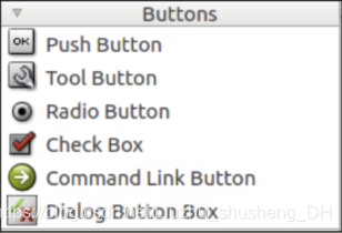 (1) QPushButton:下压按钮 (2) QToolButton:工具按钮 (3) QRadioButton:选择按钮 (4) QCheckBox:检查框 (5) QCommandLinkButton:命令链接按钮 (6) QDialogButtonBox:对话框按钮 这六种按钮部件作用简介如下: QPushButton 继承 QAbstractButton 类,被 QCommandLinkButton 继承。通常用于执行命令或触发事件。 QToolButton 继承 QAbstractButton 类。是一种用于命令或者选项的可以快速访问的按钮,通常在 ToolBar 里面。工具按钮通常显示的是图标,而不是文本标签。 ToolButton 支持自动浮起。在自动浮起模式中,按钮只有在鼠标指向它的时候才绘制三维的框架。 QRadioButton 继承 QAbstractButton 类。 RadioButton 单选按钮(单选框)通常成组出现,用于提供两个或多个互斥选项。 QCheckBox 继承 QAbstractButton。复选按钮(复选框)与 RadioButton 的区别是选择模式,单选按钮提供多选一,复选按钮提供多选多。 QCommandLinkButton 控件中文名是“命令链接按钮”。QCommandLinkButton 继承 QPushButton。 QCommandLinkButton 控件和 RadioButton 相似,都是用于在互斥选项中选择一项。表 面上同平面按钮一样,但是 CommandLinkButton 除带有正常的按钮上的文字描述文本外,默认情况下,它也将携带一个箭头图标,表明按下按钮将打开另一个窗口或页面。 QDialogButtonBox 按 钮 盒 子 ( 按 钮 框 ), 是 由QDialogButtonBox 类 包 装 成 的 。 QDialogButtonBox 继承 QWidget。常用于对话框里自定义按钮,比如“确定”和“取消” 按钮。


【本文地址】